Steve's Intro Musings:
Wasted potential. That’s what I thought when I read through this first issue of "Grunts". It could have been so much better; from art, to story to dialogue. And considering the talent involved, I expected better, dammit. What a weeping shame.
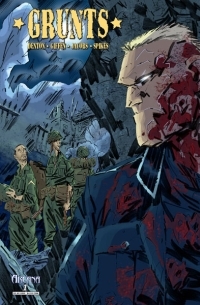 Publisher: Arcana Studios
Writing: Shannon Eric Denton; Keith Giffen
Art: Matt Jacobs; Eric Spikes
Grunts is about a group of combat hardened American GIs in 1944 France (along the German border). After a couple of actions, they come across a nastily dispatched Allied bivouac and soon encounter the German attackers, who seem to be some sort of super soldiers or something. Undead maybe? I don’t know. My first thought was to compare Grunts to the excellent Fiends of the Eastern Front comic of 2000AD fame . Of course, this made me dislike Grunts even more, even though the two comics differ greatly, and I don’t even know if the German super soldiers that pop up in the end are monsters, vampires, undercover circus clowns, or what. (Wow, think I should use the word "even" again? Yeesh!)
The first thing that reached out and grabbed me in that “creepy visiting uncle” sort of way was the art. Dear god, if the artists were trying to capture feelings of disgust and horror, they certainly succeeded… but in the worst possible way. This is some of the most terrible illustration work I’ve seen in the last few years. Every page is chock full of scribbled characters and objects with some colour thrown in. The characters are either too simple in presentation, or if they are detailed they look like, well…, more complex scribbles. Its like “How to Fail Comic Book Art School 101” or something. The action is utterly forgettable except for the laughable results from it. Heads seem to explode a lot in WW2 with teeth and eyes flying everywhere. As a big fan of zombie comics, I can safely say that gore doesn’t bother me one bit; but somehow these art guys totally fuck it up. Does that make sense? No? Okay, the battle scenes in Grunts are almost cartoonish in delivery, and not in any way good. The violence in the old movie Wizards is more shocking and compelling. The “hardcore war” panels remind me of these guys I knew in junior high that would doodle their own death metal album covers. Man, they sucked, but at least it was better than the art in Grunts. I hate to hate on anyone that works hard in this industry to bring what they love to life, but I have to be honest here, folks. To be completely fair, there are moments where it looks like the artists have some good ideas. I like the cigar. The cigar a character smokes at one point looks terrific. I think that’s it. There may be some other decent moments, but I decided to block out the art as a whole from my memory. Sorry.
(I must say that I like the cover-work for Grunts, though)
The only thing that saves this book in any way from having "1"s as a score all around is the snore-fest of a writing job (oh yeah, enjoy the "2", guys). It could have been worse—it could have been an appalling hack-job. The dialogue is too cliché, even for me! How is this possible?! I love World War 2 fiction of all kinds and I’m used to all that GI-speak; yet I was made to suffer through some of the most contrived, boring crap I’ve read in ages. Now, it’s not completely dreadful, mind you; it just makes the impact of a well pitched roll of dry paper-towels… thrown separately, one at a time. If the art was better, this would be a better comic, probably (totally, actually). The plot is standard factory press “I likes the Wolfenstein ” weird WW2 stuff (things are carnage as per usual then—POW! WEIRD!), and that’s okay since I dig the Wolfenstein videogames. However, perhaps there was too much “factory pressing”. At the end, I didn’t give one iota of a shit about this book. That’s lame, because I normally love stories like this; as long as they aren’t written in this manner.
Grunts #1 was a disappointment on many, many levels. This is the part where I predictably say something like “…but we’ll see what #2 brings”, “maybe it will improve” and other Optimistic Steve™ bullshit. Not this time. I can’t allow myself to read more of this dreck. I already subjected myself to the first issue twice, should I torment myself with future instalments? No. No way, no how. If I want some good World War 2 comics I’ll go read stuff like Fiends of the Eastern Front, G.I. Combat and Battler Britton , thanks.
(Update! The same writing team has come out with another title, Common Foe, that's great! Now -that- is what I'm talking about. Hey, even the most talented writers out there have their bad days/titles... and it's all a matter of opinion, anyway... I'm sure there are those of you who will enjoy Grunts.)
 Publisher: IDW Publishing


 Publisher